A stunning visual design goes a long way in supporting your brand identity. In fact, it enhances your branding.
From your social media graphics to packaging design, your brand imagery conveys your identity, what you stand for, and why consumers should prefer you over your competitors.
If you want to stand out as a remarkable brand, it’s best to learn from brands that have done the same before you. Then, you can use the lessons you learn from these branding examples to create your own brand strategy.
With that in mind, I analyzed the branding aspect of some of the most successful companies to understand what’s working for them.
Disclaimer: If you buy any products through links on this site, I may earn a commission. But it doesn't make any difference to your cost, and it helps me keep this blog running. So you could always read my articles for free.
Great examples of branding
I am always on the lookout for businesses with exceptional branding. So I have compiled a list of my favorite brands to bring you the best examples of branding.
Southwest Airlines
Inspired by the likes of branding giants such as Virgin, Southwest Airlines is not far behind. Not much time has passed since the company underwent a brand overhaul, adding a bit more personality to its identity.
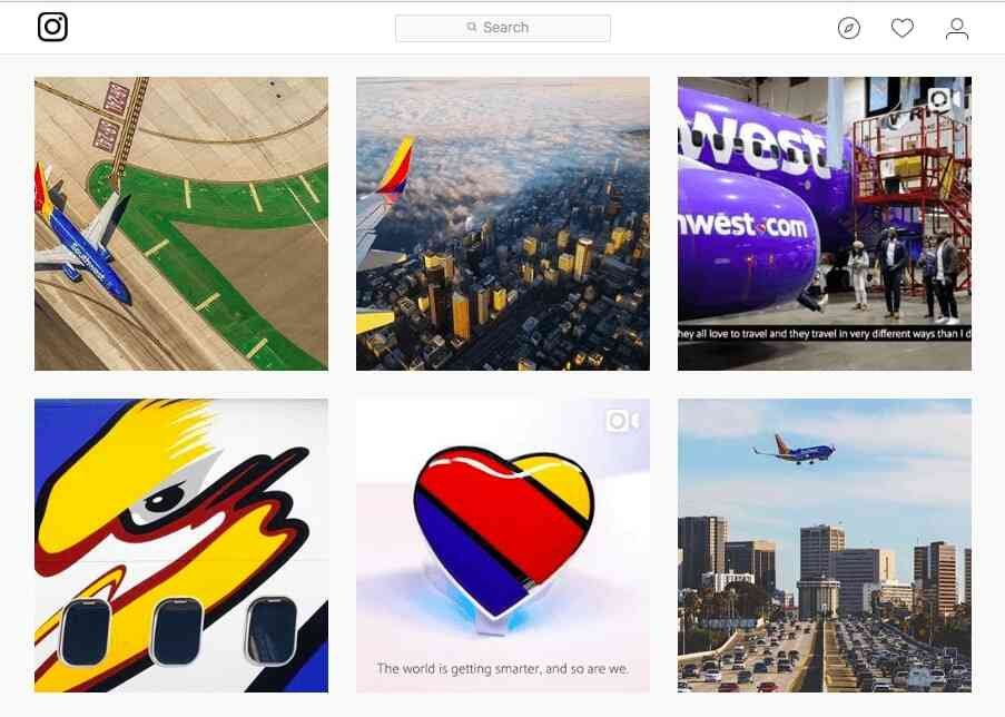
Look at the three-color scheme of red, yellow, and blue. When used together, these colors invoke a feeling of warmth. Overall, the brand feels more hospitable and inviting. Isn’t that what you would want from an airline company?
Mailchimp
Most B2B industries are not fun. And email marketing is no exception. Yet Mailchimp stands as one of the best branding examples. It has built a brand identity that reaches marketing professionals worldwide in a personable way.
Mailchimp’s brand personality is accessible, playful, and friendly. And the components that go into shaping this perception are
- Quirky and smiling brand mascot
- Distinct illustrations
- Conversational voice
An approachable personality makes a big difference. MailChimp’s branding shows that you can introduce character even in brands which are in technical or serious industries.
Sonos
How can you communicate an audio brand in a visual way? This was a challenge Sonos struggled with in its initial years.
But when they rebranded in 2015, you can tell from their visual identity that they got it right. The imagery they use is a feast for the eyes.
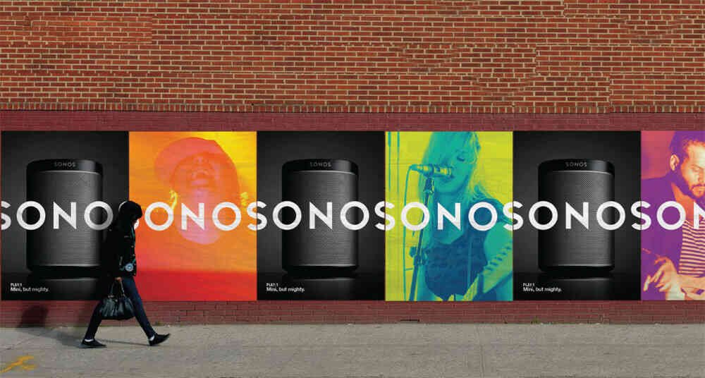
As you can see, an elegant black is combined with loud flashes of different colors. It successfully conveys the experience customers get from the product.
Casper
Casper doesn’t sell anything new. But it has managed to make a dent in the mattress industry with two things: a creative business model and a smooth brand identity. This is also evident in its content, specifically the print magazine.
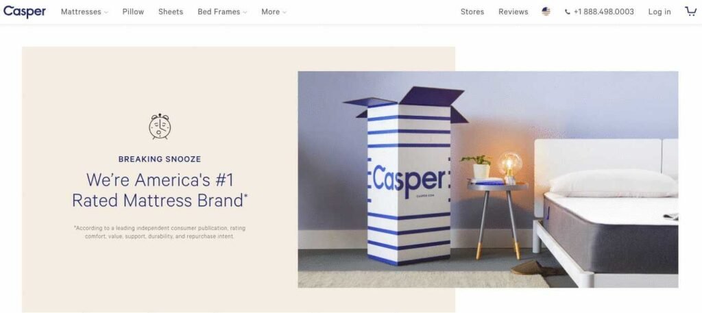
Note the calming blue and beige brand colors, along with the hand-drawn illustrations. All these components invoke a feeling of comfort in all their marketing materials, from the website to their social media channels, making it a part of my examples of branding.
Winc
Winc is for wine enthusiasts who want the beverage delivered to their homes. So obviously, convenience is a big part of what the brand conveys in its visual identity. Plus, wine is also associated with sophistication and elegance, which justifies the muted color palette.
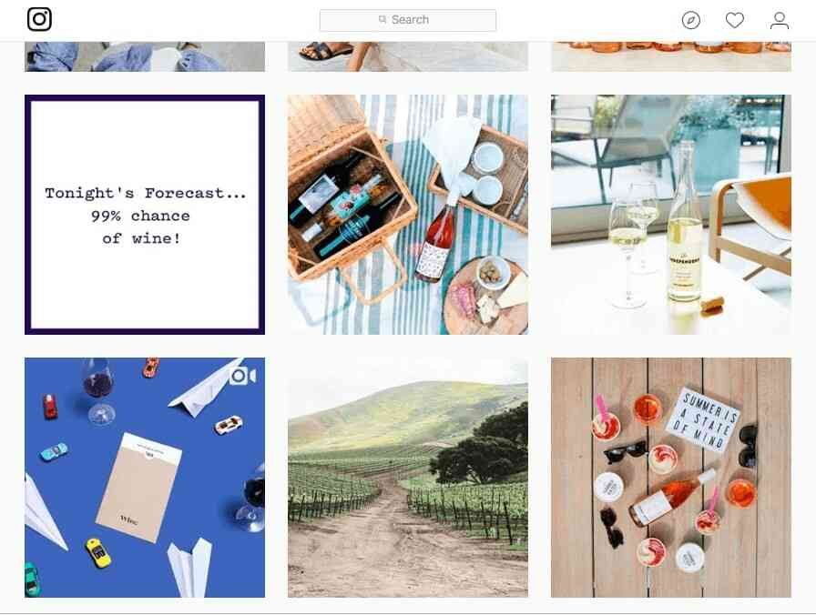
Winc’s brand is further enhanced by minimalist illustrations and simple design, accompanied by colorful accents to emphasize the product.
Lego
Lego, as one of the branding examples, is all about the power of creativity and imagination. It celebrates the joy of building. And this joy is reflected in every aspect of its branding:
- Vivid primary colors
- The simple, bold LEGO logo
- Playful imagery
All these factors trigger a sense of innovation and fun. That’s why the company has built a brand that appeals to adults just as much as children.

With its clever designs, Lego proves that a strong brand identity can tap into different demographics and regions around the world. Lego maintains a deep connection with people as they move across the age spectrum.
January Moon
January Moon is the go-to brand for the latest teething jewelry, with a highly sophisticated brand personality.
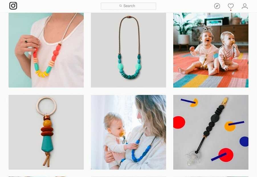
The company takes a different approach than competitors by making use of classic primary colors in imaginative ways. For example, abstract shapes and pops of color are combined with a subdued gray. So the brand gives a neat and adult vibe.
Headspace
Headspace is a meditation app that helps users reduce stress and increase their level of happiness. So it’s no surprise that it features a cheerful color scheme. And the same identity is reflected on their app, website, and Instagram account.
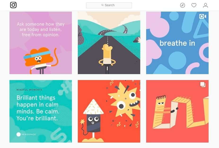
Each piece of content shared by Headspace is part of a cohesive experience, with motivational quotes and quirky illustrations. So when considering examples of branding, Headspace can’t be missed.
Rogue Ales
Rogue Ales is a beer company headquartered in Oregon. It specializes in innovating farm-to-bottle brewing. This includes growing its own ingredients and sourcing flavors from nature.
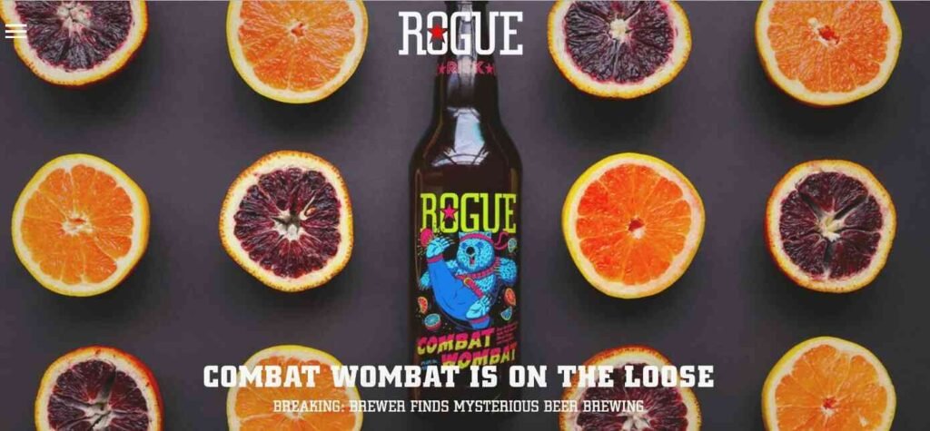
The brand’s visual identity expresses these unique benefits in many ways, from the photos they upload on social media to the hand-drawn illustrations used on product packaging. When it comes to design, its brand value proposition is emphasized in every little detail.
Thursday
Thursday is a dating app that differentiates itself with a spontaneous, bold, and direct brand identity. Its visual identity consists of a lively purple color, a memorable logo, and simple imagery.
But the one aspect that really stands out is the copy. The content is straightforward, daring, and playful, which is how they see their users.
Its outdoor advertising is as bold as its online marketing. Dating is all about connections and taking the risk of putting yourself out there. And Thursday’s branding is certainly on point with that.
Airbnb
Similar to the services provided by AirBnB, the company’s branding examples revolve around living an active lifestyle.
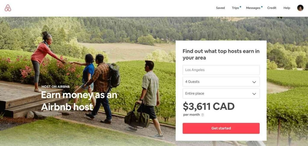
From the people-focused photos and the courageous pink logo, everything in AirBnB’s branding motivates people to go out and live life.
Oddbox
Oddbox has made a unique identity for its brand. It’s quirky, community-oriented, and sustainable, which is perfect for them as they offer wonky fruit.
The company’s energetic and fun color scheme and unique fonts go a long way in capturing consumer interest. And the box in their logo conveys a strong association with their offerings – boxes of ‘odd’ yet ripe vegetables and fruits.
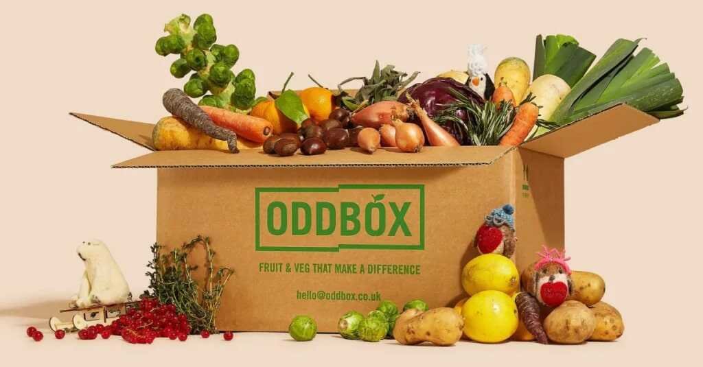
Oddbox’s focus on sustainability and reducing food waste is evident in its messaging, shaping a brand identity that appeals to conscious buyers. And it gives the customers a reason to feel good about buying from the brand.
Chobani
When it comes to examples of branding, yogurt may be considered as a mundane, everyday product. But that doesn’t mean a yogurt company’s branding should be dull. Nobody proves it better than Chobani.
The company’s signature green packaging reflects its natural and non-GMO ingredients. And it serves as a backdrop that lets the fruit pop.
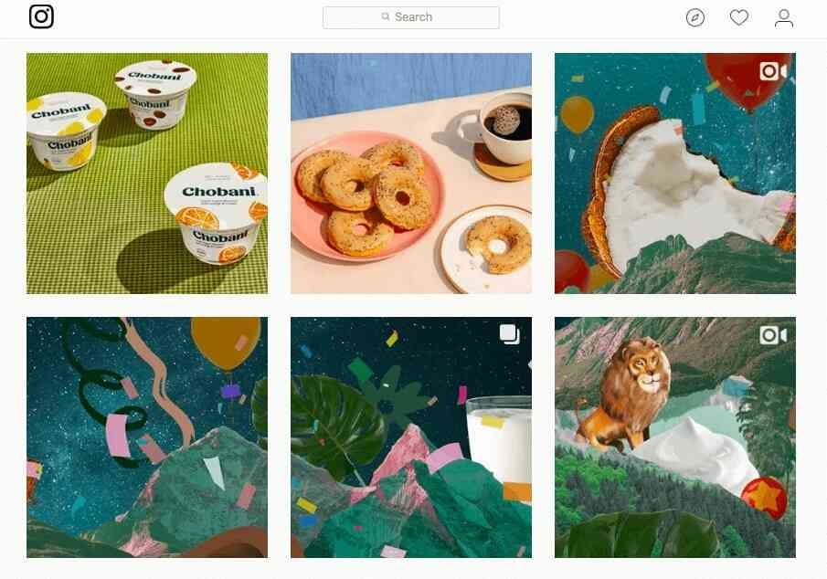
Also, the company’s Instagram uploads feature distinct digital collages and fun illustrations that experiment with its color scheme in different ways.
Patagonia
Patagonia specializes in selling outdoor apparel. And its solid brand personality is based on sustainability and environmental activism. The minimalist logo further embraces the brand’s focus on the outdoors and the world as a whole.
This brand identity example shows that if you have a strong sense of vision, you can make even a humble visual pop. Pagagonia’s devotion to environmental protection is reflected in all aspects of the company.
Dropbox
When Dropbox came into the picture, it woo’d its audience with its modern, minimal design. Then, in 2017 they enhanced the brand even further with a rebrand.
The vibrant, photography-based, and colorful brand personality is a big shift from their previous brand identity, making it a noteworthy branding example.
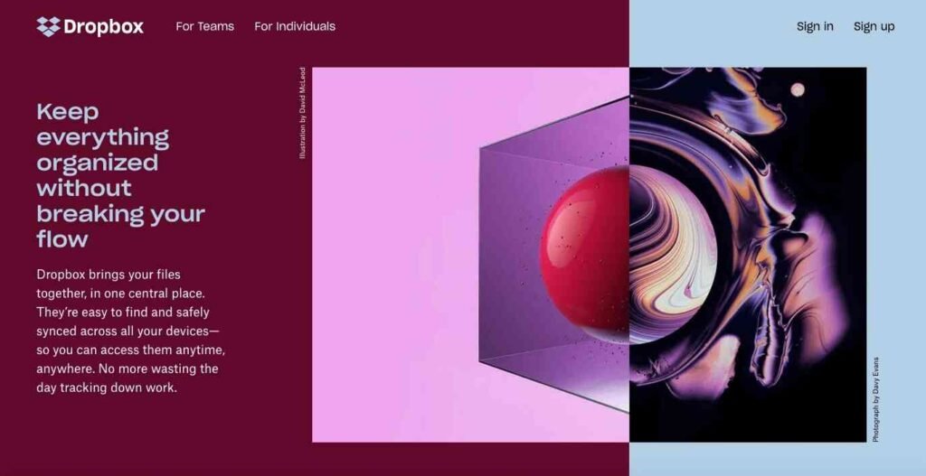
As the Dropbox feature set expands, so does the possibility of using those features together in creative ways. This limitless creativity is the message conveyed by the company’s new brand personality.
Final thoughts on branding examples
The world of branding is a dynamic landscape where creativity, strategy, and consumer engagement intersect to leave lasting impressions.
As you can see from these examples of branding that span industries and market segments, successful branding goes beyond mere recognition; it cultivates emotional connections, fosters loyalty, and drives tangible results.
Each of these branding examples serves as a testament to the power of branding in shaping perceptions and driving business success.
As businesses navigate an increasingly competitive marketplace, understanding the principles behind these branding triumphs becomes not just valuable, but indispensable for those seeking to carve their own memorable place in the hearts and minds of consumers.
Did I miss anything? Did you learn from these branding examples? Do you have any questions or comments? Share your thoughts below in the comments section.


