The homepage is one of the most visited pages on any website. Most visitors get to a brand’s website through the homepage. In most cases, it’s the first impression and experience they get of your brand.
In fact, recent research shows that UX is the biggest brand differentiator, ahead of product and price.

Unfortunately for many brands, the homepage is as far as website visitors go. This is because it’s not effective enough to move visitors to explore other pages in your website structure.
So knowing how to write website homepage content is vital if your website is to achieve its goals.
You must write homepage copy that quickly engages your audience and easily explains who you are and what you can help them with.
By crafting clear website homepage content, you ensure a positive user experience (UX) for your website visitors.
So let’s look at the essential elements of website homepage content you need for your homepage to be effective.
Disclaimer: If you buy any products through links on this site, I may earn a commission. But it doesn't make any difference to your cost, and it helps me keep this blog running. So you could always read my articles for free.
Website homepage content essentials
For your homepage to help you achieve your business goals, there are certain elements you need to master as you write website homepage copy. Here they are:
The headline
As with all other content types, your homepage headline is one of the most important elements. It tells people who you are and what value they’ll get from your website.
Another reason you need to be strategic in creating your headline is that it offers continuity.
This is especially for those who land on your homepage from another source (like social media, for example). Your homepage headline should immediately reassure them that they’re in the right place.
So how do you craft an effective homepage headline?

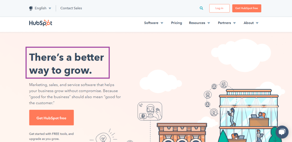
Let’s take a few pointers from this example from Hubspot:
- Address a pain point. Hubspot is a sales and marketing platform designed to help brands do one thing – grow. And they immediately make that clear in their headline.
- Make a promise. How does Hubspot do this? They promise users a better (easier, more effective) way to grow.
- Keep it simple. In 6 words, Hubspot manages to convey all the information they need to pass on to their visitors. The best homepage headlines are those that say a lot with as few words as possible.
A homepage headline with these 3 elements is bound to grab your visitors’ attention, hook them, and entice them to read the rest of your homepage copy.
Your description
After your headline, your description is the next piece of homepage copywriting your visitors should encounter.
Being a piece of information your visitors use to evaluate your brand, it must be crafted well.
- Your homepage should paint a clear description of who your business serves and what you do to help your clients.
- It also shows visitors why you’re the right brand to do business with. It should portray your unique edge – the reason you’re different from the competition.
- Apart from that, it must be as close to the top of the page as possible. That’s because research shows that it takes 2.6 seconds for visitors to settle on key areas of a page. And your description is one such key area.
Here’s a brilliantly executed example from WPMUDEV:

In a few words, the website homepage content succinctly describes what they offer and who they offer it to. This simple portion of your homepage has a huge impact on how well your homepage will convert. So give it as much love as possible.
Features of your product or service
Let’s face it. The only reason your website visitors are coming to your website is because they are looking for something.
They come because, #1 they have a problem and #2 they need a solution to that problem. And they believe you can help them overcome their challenge or achieve a certain goal.
That’s why when you write homepage copy, you must always highlight the features and benefits associated with your brand.
If your visitors don’t immediately see what they’ll gain by partnering with you, they’ll quickly move on to your competitors. This is why benefit-driven homepage copy helps in improving conversions.
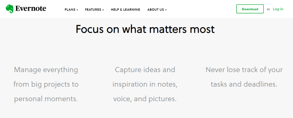
Also note that it’s not enough to just list all the features of your product or service. You need to show how those features translate to actual benefits for your audience. Take a look at this example from Evernote:

Without rambling on about the problems users face and the solutions the app offers, Evernote succinctly addresses them. In fact, it only takes 3 sentences to clearly outline the 3 major benefits of the Evernote app.
Addressing the benefits of your product/service, will set you on the path to mastering homepage copywriting. Not only will your website visitors connect with your brand, but they’ll be more likely to convert into customers.
Social proof
Another important element to include on your homepage is social proof. This can be in the form of testimonials or case studies that showcase how effective your brand is at solving your customers’ problems.
Social proof is one of the major conversion triggers. In fact, in a research study, 83% of consumers said recommendations make them more likely to purchase a product or service.
People don’t trust brands because of what they say. They trust brands because of what other people say about the brand. And that’s why your website homepage content must also feature testimonials from satisfied customers.
How can you implement social proof on your website? There are a number of ways you can do this, including:
- Testimonials. Ask your happy customers to write testimonials of their experience with your brand.
- Reviews. Encourage your customers to share reviews, either on your website or on third-party platforms.
- Case studies. A case study is simply a customer success story showing how your product/service helped the customer. Get a good copywriter to create one for you and display it on your homepage for visitors to download.
- Awards/certifications. If your business has received awards or certifications, don’t be shy to display them on your homepage.
Basecamp uses a combination of customer testimonials and reviews on its homepage as social proof. This way, any doubts visitors may have about the project management app are allayed.

In fact, research shows that people are willing to spend 31% more on a business with great reviews. That just shows the power social proof has on influencing website visitors to do business with your brand.
If you don’t have any positive reviews or testimonials to begin with, there are a number of ways to get them.
- Try reaching out to some of your prospects and offer them a free access, trial or sample of your product or service, in exchange of a review.
- Reach out to bloggers and influencers in your niche to offer an even more exclusive access not available to regular users.
- Offer your product or service at a lower price in order to get permission from your clients to showcase the work you did as case studies.
These steps are a good starting point. For more information, check out this detailed guide to get more social proof.
Overview of services or products
Having a section on your homepage that gives your visitors an overview of what you have to offer is an excellent design move. That’s because it helps your visitors immediately know what you can help them with.
Here’s a great example from Kind Snacks:

They make sure to include a summary of the products they offer right above the fold.
Remember, your homepage must give an overview of who you are and what you do, so including your services/features is a must.
Invitation to subscribe
One of the best ways to grow your business is through email marketing. According to a recent report by DMA, for every $1 you spend on email marketing, you can expect an average return of $42.
That’s why your homepage should also be part of your lead generation mechanism. You can do this by including an invitation to subscribe to your newsletter in your homepage copy.
So how do you use your homepage as a lead generation machine?
First of all, you must have a reliable email service provider (ESP). This will help you collect email addresses in a database as well as execute email marketing campaigns.
If you’re not sure which email marketing software will be best for your business, you can check this comparison by Hosting Facts.
Next, you’ll need to embed a signup form on your homepage. Check your ESP on how to do this as different service providers have their different methods.
To get people to sign up, you’ll need an irresistible offer that they’ll be willing to trade their email addresses for. Here’s a good example from Ryan Robinson:

Note how he paints a picture of the benefits of signing up to his newsletter right under the signup form. That is homepage copywriting at its best.
Because leads are the lifeblood of every business, use every opportunity to generate them. And your homepage gives you a golden platform to do just that.
A strong call-to-action
Besides being a snapshot of who you are and what you have to offer, your homepage must serve a purpose that drives you closer to your business goals.
The ultimate goal of any web page, homepage included, is to get visitors to take action. Remember, your homepage is part of your content funnel and as such, it needs to help drive conversions.
That’s exactly where your call-to-action (CTA) comes in.
While often neglected on the homepage, a strong CTA is a vital element of your homepage. It compels visitors to take the next step on your website. This could be anything from signing up for a free trial to going to a resource page.

Besides a button that stands out like a sore thumb, you must also take time to craft the copy that will be hosted in that button. To ensure your CTA copy is effective:
- Keep it concise. When it comes to calls-to-action, less is more. In as few words as possible compel visitors to take the next step into
- Use “action” words. Examples include words like “see”, “start”, “get”, and many more.
- Personalize your CTA. Generic CTAs don’t cut it anymore. Create a CTA that addresses either your audience’s main pain point or speaks about the main benefit they’ll get from your brand.
Without a strong and clear CTA, your website homepage content is incomplete. If your website visitors don’t know where to go next on your website. As a result, a good number will leave without taking any further action.
Conclusion
Your homepage should never be a second thought. If anything, invest more in it than any other page of your website. And no, not just the design, but your homepage copywriting as well.
Nailing your website homepage content is crucial to the success of your website and, ultimately, business.
This is why you must ensure you invest time and resources to design an award-winning homepage. Of course, it must be accompanied by equally amazing homepage copywriting.
Did I miss anything? Did you try these tips? Do you have any questions or comments? Share your thoughts below in the comments section.


