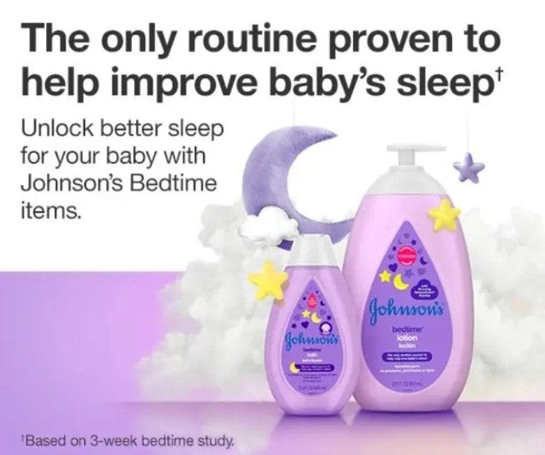
Unlike regular display ads that simply promote brands, affiliate marketing banners create a direct earning opportunity for the person displaying them. Whether as an affiliate or as a merchant, every click and purchase can mean money in your pocket.
You see banner ads for affiliate marketing across websites, but spotting them isn’t always obvious. Some affiliate banners grab attention immediately, while others blend seamlessly into content.
The real mystery lies in what separates the profitable ones from the duds. That’s what we’ll discuss in this guide.
Disclaimer: If you buy any products through links on this site, I may earn a commission. But it doesn't make any difference to your cost, and it helps me keep this blog running. So you could always read my articles for free.
Why are affiliate banners important?
Affiliate marketing banners serve as your silent sales team, working around the clock to generate income. Unlike other monetization methods, these visual tools create multiple revenue streams without requiring constant maintenance from you.
They build trust through visual appeal
When you place well-designed banners on your site, they instantly communicate professionalism to your visitors.
For example, if you’re doing display advertising for affiliate marketing, using a clean, branded banner for a software tool looks more credible than a simple text link buried in a paragraph. This visual credibility translates into higher click-through rates.
They maximize your earning potential
Besides generating direct commissions, affiliate marketing banners help you monetize different sections of your website simultaneously.
Take the case of a fitness blog: you can display protein powder banners in workout posts while showing athletic wear ads in your sidebar. This strategic placement multiplies your income opportunities.
They provide passive income streams
Here’s how banner ads for affiliate marketing work in your favor: once you install them, they continue promoting products even when you’re not actively creating content. This means you can earn money while sleeping, traveling, or focusing on other projects.
They offer flexibility in presentation
Furthermore, banners come in various sizes and formats. This means you can match your affiliate banner design with your site’s design. You can choose from small rectangular ads, large hero banners, or even animated versions, depending on your content strategy.

They track performance automatically
Most importantly, affiliate banner programs provide detailed analytics about clicks, conversions, and earnings. This data helps you understand which products resonate with your audience and optimize your placement strategy accordingly.
The bottom line is simple: affiliate marketing banners transform your website traffic into a consistent revenue source while maintaining a professional appearance that keeps visitors engaged.
How to design display ads for affiliate marketers?
Creating affiliate banners that actually convert requires specific techniques that most people overlook. Here are the steps that separate winners from failures.
Define your target audience
Identifying your audience for affiliate marketing banner ads means understanding who will actually click and buy through your promotions.
This process goes beyond basic demographics to uncover the specific pain points, interests, and buying behaviors that drive conversions. Without this clarity, you’re essentially throwing money at random visitors who have no interest in your offers.
The foundation of audience identification lies in understanding the difference between general website visitors and potential buyers.
Your banner ad audience represents a subset of your traffic – people who not only consume your content but also trust your recommendations enough to make purchases.
These individuals typically engage more deeply with your material, return frequently, and show interest in product-related content rather than just informational articles.
To pinpoint this audience, start by analyzing your existing website traffic using Google Analytics. Navigate to Audience > Demographics to see age ranges and gender breakdowns of your current visitors.
For example, if you’re promoting fitness supplements and discover 70% of your audience is women aged 25-35, you can tailor your affiliate marketing banner placements accordingly. However, demographics alone aren’t enough – you need behavioral data too.
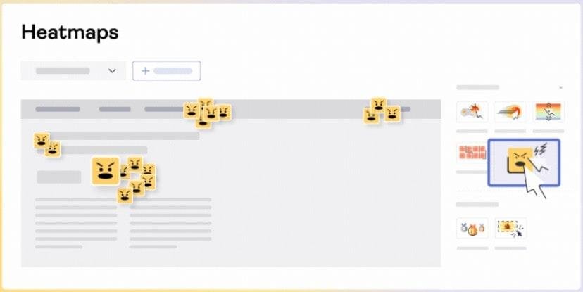
Survey tools like Hotjar reveal exactly where visitors click and how they navigate your site. Install the tracking code and review heatmaps after collecting a week of data.

This shows whether users scroll past banner locations or engage with specific content sections, helping you position affiliate display advertising where attention naturally flows.
For more details, read my guide on analyzing and defining your target audience.
Have a clear message or offer
A clear message in your affiliate marketing banner ad means communicating one specific benefit or offer that immediately tells visitors what they’ll gain by clicking.
This clarity eliminates confusion and decision paralysis that occurs when people see vague or cluttered advertisements. Without a focused message, potential customers scroll past because they can’t quickly understand the value proposition.
The most effective banner ads focus on solving one particular problem rather than listing multiple features. For example, instead of saying “Amazing software with tons of features,” you’d write “Cut your email writing time in half.”
This approach works because people make split-second decisions about whether content is relevant to their immediate needs.
Here’s how to develop this clarity by analyzing your affiliate product’s core benefit.
Start by listing every feature the product offers, then identify which one solves your audience’s biggest frustration.
Take the case of promoting a password manager – while it offers encryption, syncing, and form-filling, your audience likely cares most about “never forgetting passwords again.”
Besides that, test your message clarity by reading it to someone unfamiliar with the product. If they can’t immediately explain what the offer does and why they’d want it, your message needs simplification. Focus on the single outcome that matters most to your specific audience segment.
Choose the right design tool
Choosing the right design tool for your affiliate marketing banner ads directly impacts both your creation speed and the final visual quality that drives clicks.
The wrong tool can leave you struggling with complex interfaces or produce affiliate banner designs that look unprofessional and can hurt your credibility.
Your choice depends on your design experience, budget, and the specific banner requirements of different affiliate programs.
Design tools fall into three main categories: beginner-friendly drag-and-drop platforms, professional software, and specialized banner creators. Each serves different skill levels and project needs.
For example, someone creating their first banner ads needs intuitive templates and simple editing, while experienced marketers might require advanced customization options.
Canva works well for beginners who want to design banner ads for affiliate marketing. This is because it offers pre-made banner templates in standard sizes like 728×90 leaderboards and 300×250 rectangles.
You simply select a template, replace the placeholder text with your affiliate offer, and download the finished banner. The platform includes thousands of stock photos and fonts, eliminating the need to source external assets.
Besides that, consider your volume needs. If you’re creating dozens of banner variations for split testing, tools with batch editing features or template duplication will save significant time compared to starting each design from scratch.
For more details, check out this article on online banner makers.
Use your brand’s color palette
Using your brand’s color palette for affiliate marketing banner ads creates visual consistency that builds trust and recognition with your audience.
When visitors see banners that match your website’s existing colors, they immediately understand these promotions come from you rather than feeling like intrusive third-party advertisements.
This familiarity increases click-through rates because people are more likely to engage with content that feels like a natural extension of your brand.
Your color palette serves as a visual bridge between your content and affiliate offers. For example, if your fitness blog uses navy blue and orange throughout the site, incorporating these same colors in your protein powder banner ads maintains the cohesive experience visitors expect.
When it comes to display advertising for affiliates, consistency is key. It signals professionalism and intentional curation rather than random placement.
If you don’t know your brand colors, use a browser extension like ColorZilla to identify the specific hex codes from your website’s header, buttons, and accent elements.
Or, you can simply right-click on any colored element and select “Inspect Element” to find the CSS color values. When creating your banner ads for affiliate marketing, most design tools allow you to input these hex codes directly. This ensures perfect color matching across all your promotional materials.
Use your brand’s typography
Typography extends beyond just font choice – it includes letter spacing, font weights, and text hierarchy that collectively create your brand’s voice.
When your affiliate marketing banners use the same fonts as your website headers and body text, visitors subconsciously connect the promotional content with your trusted recommendations rather than viewing them as external advertisements.
Using consistent typography in your affiliate banner design also communicates professionalism and attention to detail. For example, if your travel blog uses a clean sans-serif font for headlines and a readable serif for body text, maintaining this combination in your hotel booking banner ads creates seamless brand integration.
Understand your brand’s voice and tone
When it comes to banner ads for affiliate marketing, using your brand’s voice and tone ensures your promotional content feels authentic and trustworthy to your audience.
Voice represents your brand’s personality – whether you’re friendly, authoritative, or humorous – while tone adapts this personality to specific situations. Here’s an example of a friendly and supportive brand voice in a banner ad.

When your affiliate marketing banners match the communication style visitors expect from your regular content, they’re more likely to click because the messaging feels genuine rather than like generic advertising copy.
Mismatched voice creates disconnect and skepticism. For example, if your personal finance blog typically uses encouraging, supportive language but your investment app banner reads like aggressive sales copy, readers will notice the inconsistency and question your authenticity.
Review your most popular blog posts and identify recurring phrases, sentence structures, and emotional approaches you naturally use.
Create a simple document listing these patterns – do you ask questions, use contractions, or include personal anecdotes? Then apply these same communication habits to your banner text.
Stick to fundamental graphic design principles
Graphic design principles shape how viewers interact with your affiliate marketing banner ads. These core rules guide the eye, create hierarchy, and drive action. When you ignore them, your ads blend into the background noise of the internet.
Contrast draws attention first. You need stark differences between your text and background colors. For example, white text on a dark blue background creates immediate visibility. Besides that, using contrast in your affiliate banner design helps separate your main message from supporting details.
Alignment creates professional polish. When you line up elements along invisible guides, everything looks intentional rather than scattered. Take the case of left-aligning your headline, product image, and call-to-action button – this creates a clean visual path.
White space prevents overwhelm. You don’t need to fill every pixel with content. Here’s how spacing works: it gives your viewer’s eye places to rest while emphasizing your key message.
Strategic gaps make your banner feel premium rather than cluttered. If you use this method while doing display advertising for affiliate marketing, it will ultimately improve your click-through rates.
To learn more, check out this post on the fundamentals of graphic design.
Highlight key elements like offers or CTAs
Your call-to-action (CTA) serves as the bridge between viewer interest and actual clicks. Without it, people might admire your affiliate marketing banner ads but never take the next step.
Think of your CTA as the final push that transforms casual browsers into engaged prospects.
Action words create momentum. You want verbs that spark immediate response rather than passive consideration.
For example, “Get Started” works better than “Learn More” because it implies forward movement. Besides that, specific actions like “Download Now” or “Claim Offer” tell people exactly what happens next.
Placement matters for visibility. Your CTA should sit where the eye naturally lands after viewing your main message. Take the case of positioning it in the bottom-right corner – this follows the typical reading pattern while maintaining visual balance.
Contrast makes your button stand out. Here’s how color psychology works in your banner ads for affiliate marketing: your CTA needs to pop against the background while staying consistent with your brand. A bright orange button on a blue banner creates the urgency needed to drive clicks.
Create different variations and dimensions
Different websites require specific banner dimensions, and you can’t use a one-size-fits-all approach. Each platform has preferred ad sizes that maximize visibility and performance. When you create only one version, you limit your reach and miss potential placements.
Standard sizes cover most opportunities. You should start with common dimensions like 728×90 leaderboards, 300×250 medium rectangles, and 160×600 skyscrapers.
For example, blog sidebars typically use the medium rectangle format, while header spaces prefer leaderboards. Besides that, mobile screens need smaller, vertical formats that fit phone displays.
Content adaptation requires strategic thinking. Here’s how sizing affects your message: larger affiliate marketing banner ads allow detailed product shots and longer headlines, while smaller formats demand simplified text and focused imagery.
Take the case of a 728×90 banner – you have horizontal space for multiple elements, but a 160×600 skyscraper forces vertical stacking.
Testing reveals performance patterns. Different dimensions perform better on specific sites and audiences, so you need multiple versions to optimize your campaign reach.
To know more, read this post on top banner ad sizes.
Optimize for mobile devices
Mobile devices now handle most web traffic, yet many affiliate banners still look terrible on phone screens. Your desktop-perfect ad might shrink to unreadable text or get cut off entirely on mobile.
This creates missed opportunities since people browsing on phones simply scroll past banners they can’t interact with properly.
Text size determines readability. You need fonts large enough to read without zooming.
For example, headlines should be at least 18 pixels on mobile, while body text requires 14 pixels minimum. Besides that, consider how finger taps work – your clickable areas need enough space for accurate touching.
Vertical layouts work better for affiliate banner design than horizontal ones. Here’s how mobile screens differ: they’re tall and narrow, so stacked elements perform better than side-by-side arrangements. Take the case of moving your product image above your headline instead of beside it.
Loading speed affects engagement. Mobile users expect instant results. So when creating your banner ads for affiliate marketing, you should optimize image file sizes while maintaining visual quality to prevent slow-loading.
For more details, check out this post on mobile banner ads.
Final thoughts on affiliate marketing banner ads
Creating effective affiliate marketing banners requires attention to multiple moving parts. You need solid design principles, clear calls-to-action, multiple size variations, and mobile optimization working together.
Each element supports the others – great visuals mean nothing without a compelling CTA, while perfect mobile formatting won’t help if your design lacks contrast.
When it comes to display advertising for affiliates, success comes from testing and refining your approach. You’ll discover which combinations work best for your specific audience and products. Some banners will perform better on certain websites, while others excel on mobile platforms.
The key lies in creating a systematic process rather than relying on guesswork.
Start with one well-designed banner that follows these fundamentals, then expand your collection based on performance data.
Remember that effective affiliate marketing happens when you consistently deliver value to viewers while maintaining professional standards across all your promotional materials.
Did I miss anything? Did you try these tips create banner ads for affiliate marketing? Do you have any questions or comments? Share your thoughts below in the comments section.


