Looking to transform your blog into a visual masterpiece that engages your readers and helps them navigate easily?
Taking a look at other blogs might help you come up with ideas for your own. So, explore these blog design examples that show how effective design can captivate readers and enhance user experience.
From sleek layouts to eye-catching graphics, you’ll find inspiration and practical tips to make your blog stand out in a crowded digital space.
Disclaimer: If you buy any products through links on this site, I may earn a commission. But it doesn't make any difference to your cost, and it helps me keep this blog running. So you could always read my articles for free.
Stunning blog design examples
Here are inspiring blog design examples to elevate your site. See how top designs boost engagement and grab attention.
Cookie + Kate
The Cookie + Kate blog stands out with its clean, inviting design and user-friendly layout. The site features vibrant images, easy navigation, and a clear focus on content.
Notice how the blog uses spacious, well-organized sections to highlight recipes and articles, making it easy for you to find what you’re looking for.
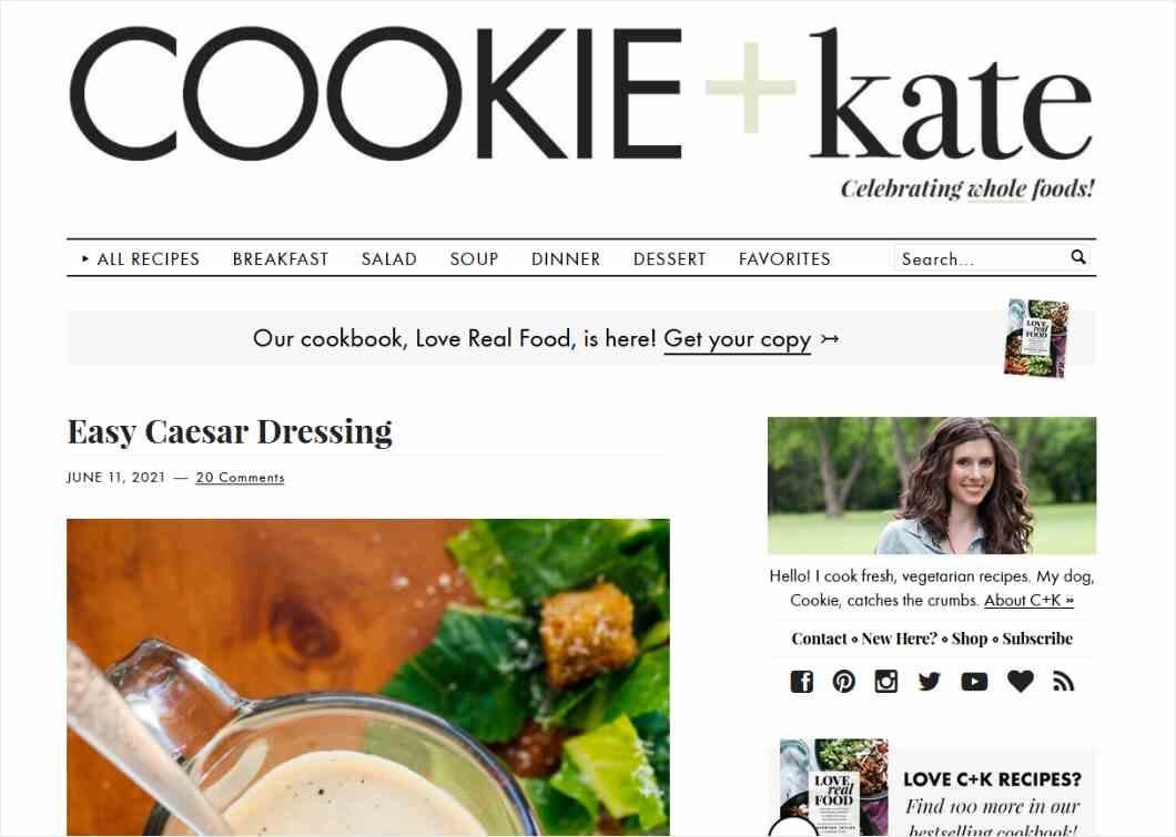
The consistent use of colorful, high-quality photos adds visual appeal and keeps readers engaged.
By studying Cookie + Kate as a blog design example, you can learn the importance of simplicity, visual consistency, and a strong focus on content in creating an attractive and effective blog design.
TED blog
The TED blog impresses with its minimalist, sophisticated design and intuitive navigation. The clean layout highlights the content while avoiding distractions, making it easy for you to focus on the ideas presented.
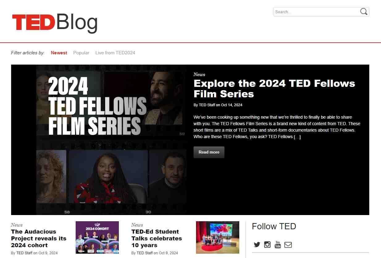
Bold typography and ample white space ensure readability and emphasize key points. TED’s use of engaging visuals and clear sectioning showcases how to effectively combine text and media.
From this blog design example, you can learn the value of a clutter-free design, the impact of striking visuals, and the importance of a layout that directs readers’ attention to essential content, enhancing both user experience and content engagement.
Dan Flying Solo
Dan Flying Solo features a bold and dynamic design that captures attention immediately. The use of striking images and a vibrant color scheme creates a visually engaging experience.
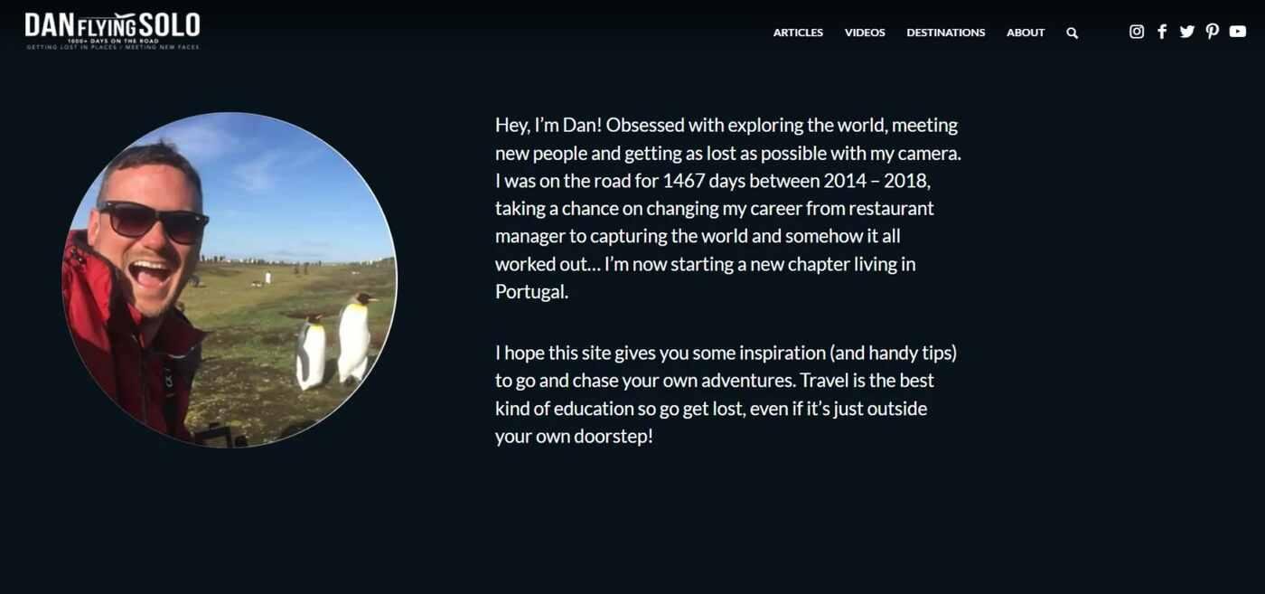
The blog’s well-structured layout, with clear headings and ample white space, makes it easy for you to navigate and find content. Dan Flying Solo also integrates personal branding seamlessly, making the blog feel approachable and authentic.
From this example of blog design, you can learn how to use strong visuals and cohesive branding to make your blog stand out. Additionally, effective use of layout and color can significantly enhance readability and user engagement.
Tiny Budhha
The Tiny Buddha blog captivates with its serene and inviting design. The soft color palette and minimalist layout create a calm, uncluttered environment that enhances readability.

The use of high-quality images and well-spaced text in this example of blog design draws your attention to the content without overwhelming you. Each section is thoughtfully organized, making it easy for you to explore topics and find inspiration.
From Tiny Buddha’s design, you can learn the power of a peaceful aesthetic in improving user experience.
Emphasize simplicity, balance, and visual harmony to create a welcoming space that keeps readers engaged and encourages them to return.
He Spoke Style
He Spoke Style showcases a sleek, modern design with a strong focus on visual appeal. The blog’s use of high-quality images, sophisticated typography, and a well-organized layout creates a polished, professional look.
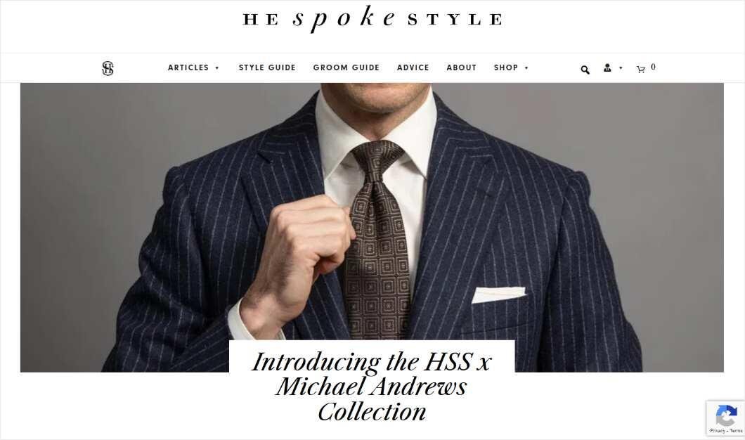
The clean navigation and clear categorization make it easy for you to browse through fashion and style content. The strategic use of whitespace and bold headlines directs your attention to key areas without clutter.
From this blog layout example, you can learn the importance of a refined design that balances aesthetics with functionality. Prioritize visual consistency, user-friendly navigation, and a clean layout to enhance your blog’s overall impact.
Julian Shapiro
Julian Shapiro’s blog features a sleek, minimalist design that emphasizes clarity and focus. The clean layout and straightforward navigation ensure that you can easily access insightful content without distractions.
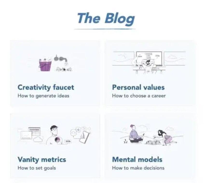
This blog design example uses a restrained color palette and crisp typography to enhance readability and highlight key points. The strategic use of white space and concise formatting keeps the blog looking professional and engaging.
From Julian Shapiro’s design, you can learn the value of a clean, focused aesthetic in creating an effective blog. Prioritize simplicity, readability, and easy navigation to deliver a seamless user experience that draws readers in and keeps them engaged.
Help Scout
The Help Scout blog excels with its user-centric design that combines functionality and visual appeal. The blog features a clean layout with ample white space, making it easy for you to read and navigate through content.
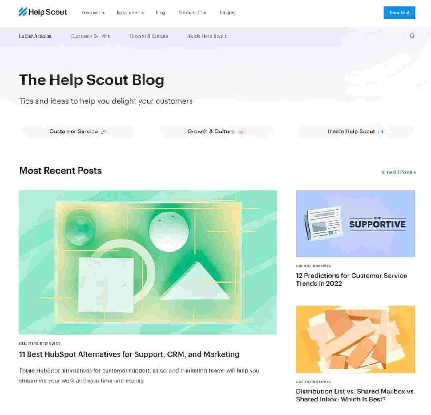
The use of clear headings, engaging visuals, and concise text in this example of blog layout ensures that information is presented in an accessible way. Help Scout’s consistent branding and well-organized structure highlight how a cohesive design can enhance user experience.
From this blog, you can learn the importance of creating a layout that is both visually pleasing and practical. Focus on readability, effective organization, and engaging elements to improve your own blog’s impact.
Mom Boss Life
Mom Boss Life features a vibrant, energetic design that aligns perfectly with its entrepreneurial focus. The blog uses bold colors, playful fonts, and engaging visuals to create a lively, welcoming atmosphere.
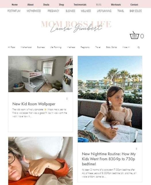
The well-organized layout includes clear headings and intuitive navigation, making it easy for you to find relevant content quickly. Each post is visually appealing and complemented by actionable advice.
From this example of blog design, you can learn how to use a dynamic design to capture and maintain reader interest. Prioritize a colorful, engaging aesthetic, clear structure, and actionable content to create a blog that resonates with your audience and enhances their experience.
All the food
All the Food Blog impresses with its clean, appetizing design that highlights delicious recipes. The use of high-quality images and a minimalist layout makes it easy for you to focus on the mouth-watering visuals and engaging content.
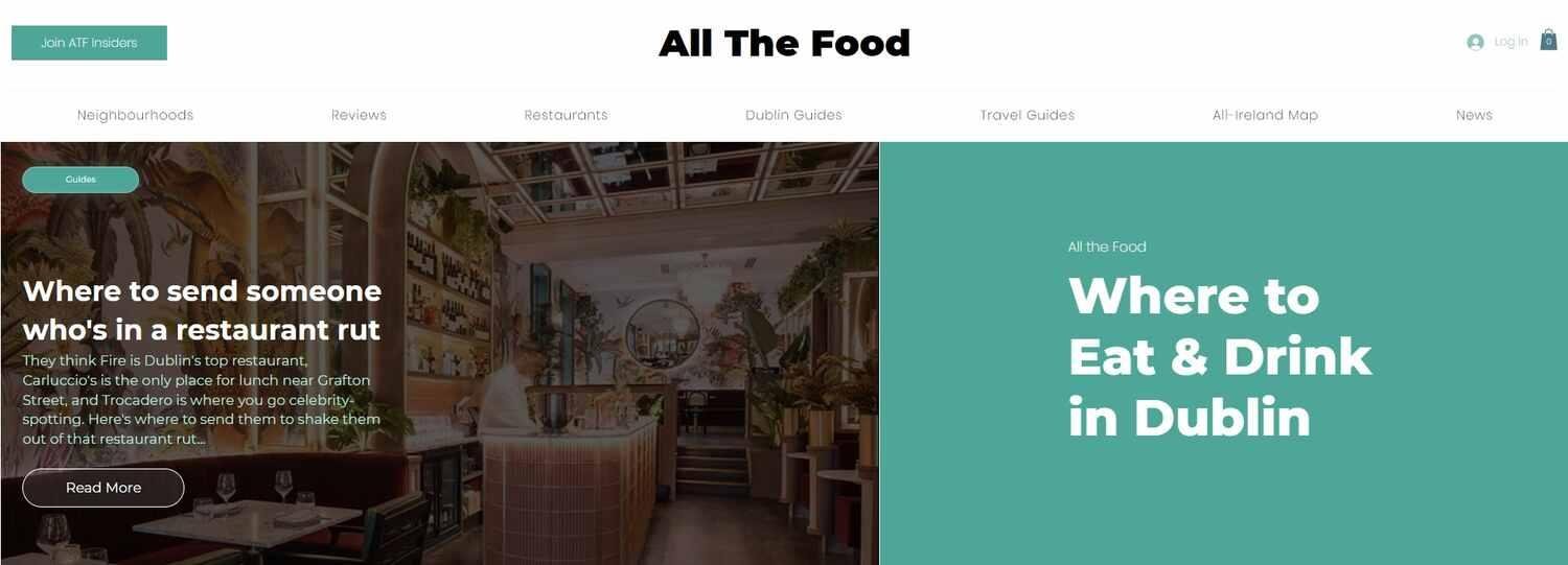
The blog’s straightforward navigation and clear categorization help you quickly find recipes and related articles. Ample white space and bold typography ensure readability and a pleasing aesthetic.
From All the Food Blog, you can learn the importance of using striking visuals, maintaining a simple layout, and organizing content effectively.
Emphasize appealing imagery and clear navigation to create a blog that draws readers in and keeps them coming back.
Urban roots
The last blog design example we’ll take a look at is the Urban Roots Blog which captivates with its modern, vibrant design that reflects its focus on urban lifestyle and sustainability. The blog features striking visuals, bold colors, and a clean layout that make content easy for you to engage with.
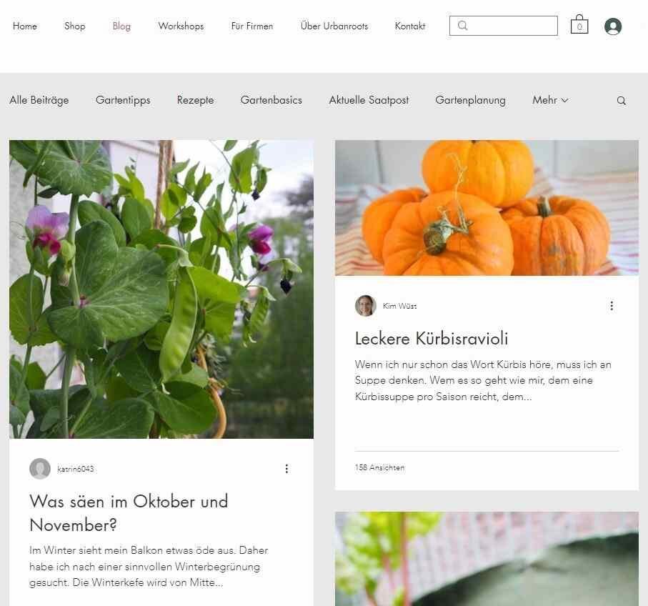
The use of high-quality images and well-organized sections highlights key topics and creates a visually appealing experience. Urban Roots also incorporates clear typography and intuitive navigation, ensuring a seamless user experience.
From this blog, you can learn the value of a visually engaging design that complements your content. Focus on dynamic visuals, effective organization, and user-friendly navigation to enhance your blog’s appeal and functionality.
Over to you
Exploring various blog design examples reveals how impactful design can be in shaping your blog’s success.
By analyzing different styles, you can see how visual appeal, layout, and user experience all play crucial roles in engaging readers and delivering content effectively.
Whether it’s the clean, minimalist approach of some blogs or the vibrant, dynamic designs of others, each example offers valuable lessons.
Implementing these insights can help you create a blog that not only captures attention but also keeps your readers coming back.
Did I miss anything? Did you learn anything from these blog layout examples? Do you have any questions or comments? Share your thoughts below in the comments section.


