A brand’s visual identity should be able to convey its authenticity. It should present how the brand behaves in a way that’s true to its values.
On top of that, customers appreciate a brand aesthetic that resonates with them on a personal level.
So how do you make sure that your brand personality is keeping up with buyers’ evolving preferences?
Of course, by staying on top of the latest branding trends. That’s why I analyzed what’s happening in the world of brand design: logos, web design, product packaging, graphic design, and typography.
And I have compiled some thoughts on what it could mean for the future of branding. Let’s dig into my branding predictions.
Disclaimer: If you buy any products through links on this site, I may earn a commission. But it doesn't make any difference to your cost, and it helps me keep this blog running. So you could always read my articles for free.
Latest branding trends to get inspired
The latest branding trends reflect a shift towards authenticity, personalization, and purpose-driven messaging, where consumers seek meaningful connections with brands that align with their values.
From immersive storytelling to minimalist design approaches, brands are leveraging innovative strategies to stand out in a crowded market and forge lasting emotional bonds with their audiences.
Eco-friendly branding
As per a 2022 report, about 60% of respondents say that they’re likely to prefer products from food and beverage brands that focus on sustainability.
50% of the same participants are likely to buy from healthcare businesses that emphasize sustainability. And nearly 45% have the same sentiment toward retail and ecommerce products.
Obviously, businesses have been paying attention to shape the future of branding. Brands are increasingly refining their messaging and conveying their sustainable values through planet-focused designs. Needless to say, I am expecting clean and aspirational visuals to spread in the eco-friendly niches in the coming months.
Case in point: Grove Collaborative. This environmentally-focused business uses minimalistic design in its website, social media, and packaging.
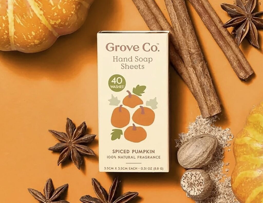
The company’s packaging consists of muted colors that evoke a calm and soothing feeling. It resonates with people who aspire to have a germ-free and clean household but in a way that’s eco-friendly.
Serifs are coming back
Minimalism is one of the branding trends that has been going strong for years. It has been immensely popular for its aesthetic appeal, not to mention its practical advantages.
After all, minimalistic designs load faster and require less modification to be adapted to different print materials and screen sizes.
But minimalism in brand design can often lead to a design that lacks enough character and uniqueness for your brand. This has led to the adoption of certain non-minimalistic but bold design decisions, such as using serif fonts.
Serifs are usually associated with being old and traditional, but many brands have started using them for their potential to convey a brand’s distinct personality.
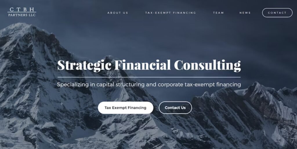
So going forward, you can expect to see a lot of customized and outstanding serifs used by different brands.
They come across as individualized and strong. And brands are using them to strike a balance between the feelings of being classic and modern at the same time.
That said, keep in mind that serifs are a great choice only when they’re used on rare occasions. For example, you can use them in headings and logos, but not when there’s a lot of text to read.
They’ll certainly make your titles look bolder, but using them for a whole article will make it hard for people to focus and read.
Vintage-style packaging and logos
Vintage-style logos are usually based on a hand-drawn illustration. This illustration is surrounded by an emblem frame that has the brand name in a hand-lettered typeface. You can also fit a slogan in that frame if there’s enough space.
On top of that, there’s typically a textured appearance that gives the logo a weathered effect and makes it look more authentic.
Similar branding predictions include vintage packaging, which is similar to vintage logos. The only difference is that it’s more flexible, whereas logos follow a strict style.
You can identify vintage packaging design from several elements. It uses natural and muted colors, a hand-made feel, and classic fonts.
Minimalism and neo-minimalism
The minimalist design choices started in the 2010s to appease Millennials. Since then, they have continued to be a powerful branding trend. According to research, nearly 60% of top brands use a minimalist logo.
Why? Because most people find uncluttered designs and monochromatic color choices to be simple and soothing, in stark contrast to today’s chaotic and complicated world.
The minimalism design trend is also used heavily by luxury brands. The clean appearance and sleek design resonate with the kind of audience they are targeting.
Besides that, minimalist designs also have a tangible benefit. They can look great on different types of promotional materials and screen sizes.
Even when working with small areas like social media profiles and app icons, a minimalist design won’t need too much modification.
Minimalism is evolving even further these days, leading to new trends such as neo-minimalism. Neo-minimalism is when you take the properties of minimalism and amplify them even further.
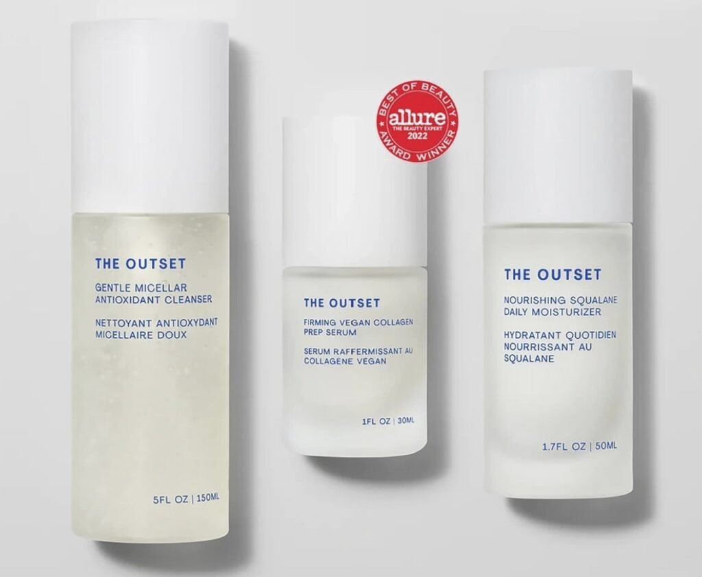
This means even more negative space and fewer details, along with vibrant colors and strong typography. For example, think of logos with only a couple of shapes and lines, while still having symbolic imagery. Fonts and colors do all the heavy lifting.
The luxury skincare brand, The Outset, is a good example. The company’s logo is nothing but a clean, blue wordmark. The items are sold in white bottles with minimal blue text.
Minimalism is also impacting CPG branding. For example, Chicken of the Seas refreshed its brand with a logo that uses a minimalistic font and cleaner design.
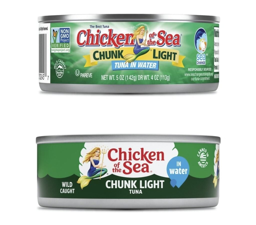
As you can see, the old packaging was too noisy as compared to the new, changing the future of branding.
Multiple logo variations
Businesses are increasingly moving from having a single logo design to multiple optimized logos for different applications.
For example, you can use a compact version of your logo for your mobile app, and a black-and-white version for T-shirt printing.
Here are key factors you can consider when deciding on possible logo variations as part of brand design:
Responsive: You may need one or more variations for the logo to render correctly on digital platforms. It should adapt to different screen sizes and devices such as desktops, smartphones, and tablets.
Contextual: Your logo will differ based on where it’s used. For example, it can be a one-tone logo when used on business cards and a customized logo when used on merchandise like baseball caps.
Variable: The specific components of your logo may vary to suit different marketing campaigns, product lines, and target audiences.
The point is that your logo will have multiple versions to match multiple needs. But you don’t have to go overboard with this strategy. Usually, 3-4 variations will be enough for most cases.
Proactive negative space
I am coming across more and more examples of branding trends that use negative space proactively. That means they use white space to convey a clever meaning or hidden message.
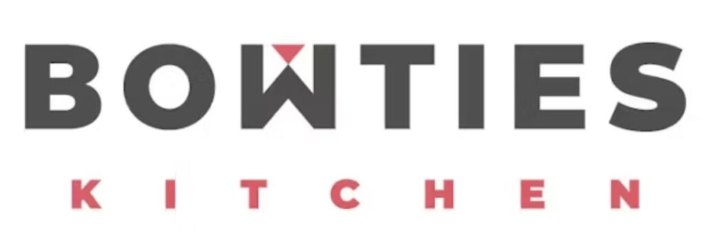
This branding prediction goes a long way in adding an extra layer to your branding without adding more elements. When you turn empty space into a visual, your design looks more dynamic and interesting.
Conveying raw authenticity with hand-drawn illustrations
Modern customers want authenticity from companies. Research by Forrester on the future of branding found that 71% of buyers connect with and support authentic brands.
When people view a brand as authentic, it helps them forge an emotional connection to the company and spread the word about it.
So how are brands conveying authenticity nowadays?
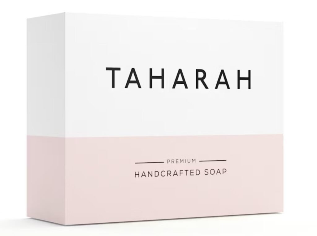
One factor is hand-drawn illustrations. They typically look raw and unpolished, but that’s intentional. The unfinished look adds to the brand’s personality and authentic presence. Bare Soaps uses this approach with great success.
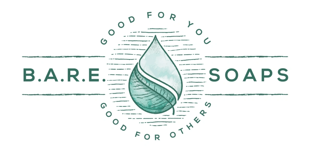
As you can see, the company’s logo doesn’t have much in terms of design and color. However, the illustration shows the brand’s focus on natural ingredients and sustainability.
Tapping into the past
Leveraging nostalgia is a powerful method for companies to take customers back to cherished times.
Regardless of the era you choose to bring back in your brand design, classic visuals invoke cheerful and calming feelings in buyers.
For example, several companies are reviving the retro design of the 1970s with a modern look and feel. They are utilizing earthy color palettes with warm colors such as orange, red, and brown.
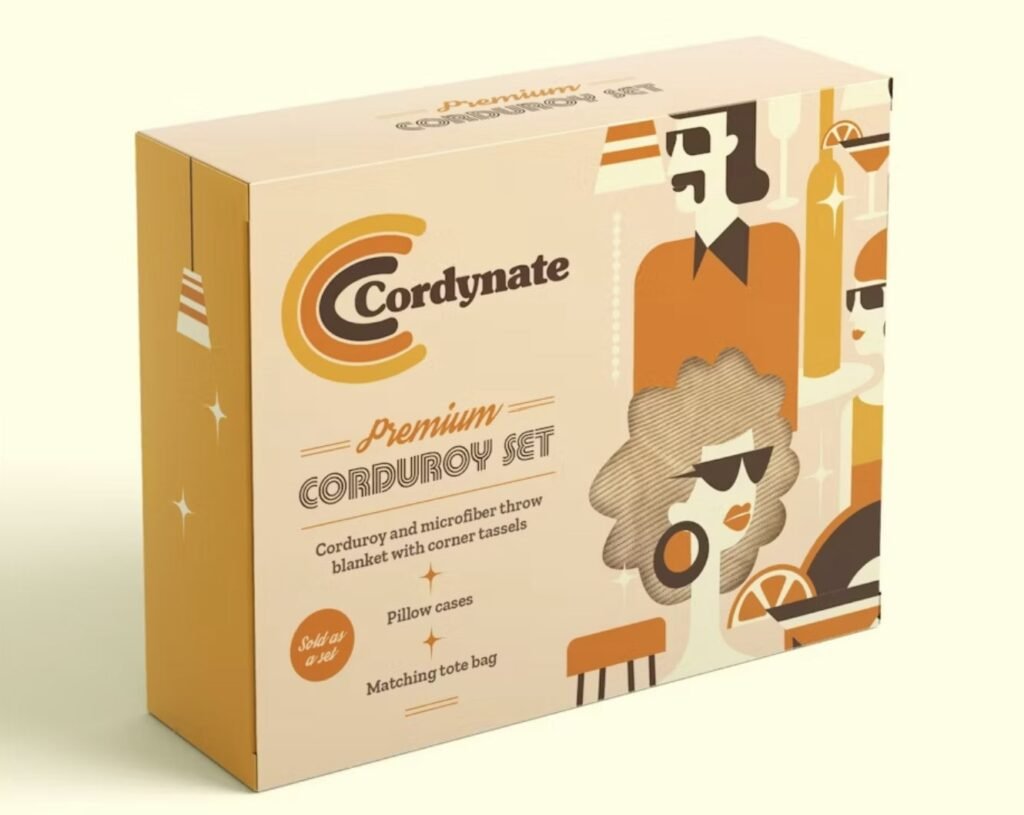
This strategy lets businesses express their brand personality in a vibrant, engaging way. Plus, it brings out the happy memories in buyers’ minds. It provides a way for them to explore uncharted territories and relive the good old days.
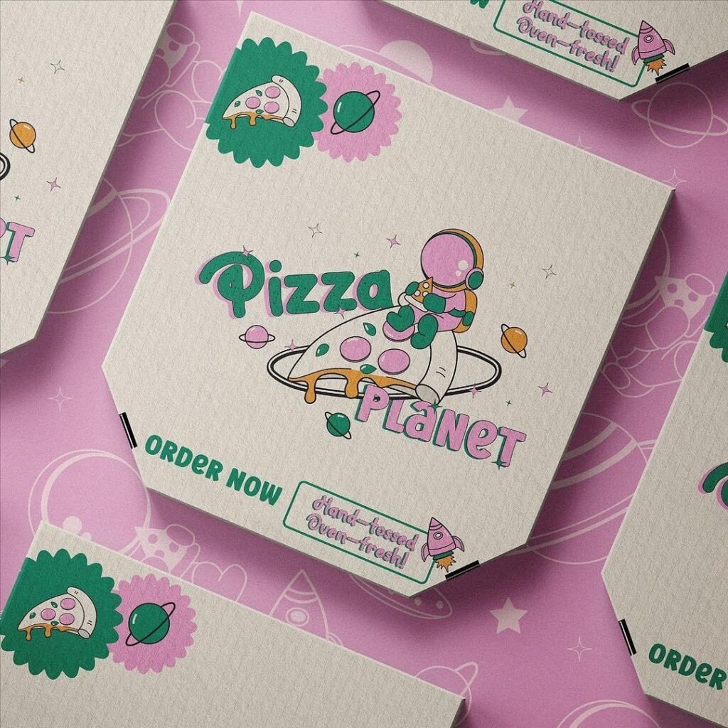
In another example, brands like Pizza Planet and Lemme are reviving the 2000s by using metallics, pastels, and old-school illustrations.
Replacing letters with abstract symbols
Another popular addition to branding predictions is giving your logos and packaging a light, abstract look and feel. The objective is to convey a quick, unique vibe to customers with short attention spans, which includes almost everyone these days.
Love to Ride, for example, is a cycling brand that uses this branding trend. If you look at the company’s logo, you’ll see that both the Os have been replaced by vibrant circles.
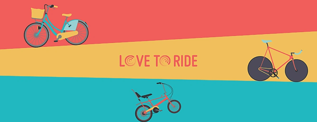
Now, these circles are not exact replicas of cycle wheels, but they convey the message. And they make sure that the logo instantly conveys what the brand stands for.
Humanizing brands with mascots
The concept of using mascots for branding isn’t new. The history of brands is full of popular mascots such as the Energizer Bunny, Mr. Clean, and the Michelin Man. But I am seeing an increase in mascots from both new and small businesses.
Mascots have the potential to boost brand loyalty and differentiate a brand from the competition. In fact, a study found that mascots can increase the emotional connection consumers feel by over 40%.
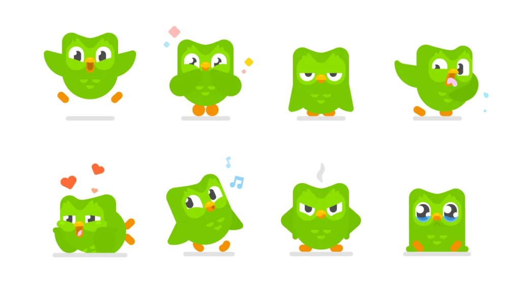
That’s why using Mascots is another fast-growing trend. For example, Duo from Duolingo is a mascot that is doing really well. It has gained a large social media audience, with over 10 million followers on TikTok.
Conclusion: next-level branding trends
For the brands of today, building an emotional connection with buyers is key. And these branding trends indicate what buyers expect at present and in the future.
To meet these expectations, businesses are adopting different branding approaches, from invoking nostalgia to humanizing themselves with mascots.
But the good news is that you don’t have to copy any one approach. Rather, look at these trends as inspiration and try to incorporate branding techniques from across the spectrum to come up with something creative.
Did I miss anything? Did you try these tips? Do you have any questions or comments? Share your thoughts below in the comments section.


