There is a lot of talk among content marketers and web design professionals on essential components for delivering a great experience to the end user.
After all, these end users are prospects which can turn into leads and then customers down the line.
However, there is one component that doesn’t get enough attention – content architecture, also known as information architecture or website structure.
As you know by now, I am the flag bearer of overlooked causes. So in this guide, I will go over content architecture, website accessibility, and the best way to organize knowledge on your website/blog for both humans and search engines.
Disclaimer: If you buy any products through links on this site, I may earn a commission. But it doesn't make any difference to your cost, and it helps me keep this blog running. So you could always read my articles for free.
What is content architecture?
Content architecture refers to the overall hierarchy and organization of all the associated content, including all the pages and posts.
It includes the division of content into different pages, how they are arranged and linked, and how users navigate among those pages.
In other words, it’s how you organize knowledge, keeping website accessibility best practices in mind.

Having a properly planned content architecture is important because it makes your content easy to find, understand and navigate for both humans and search engines.
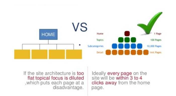
Most modern websites follow an information architecture based on content themes, also known as Theme Pyramids or Topic Clusters.
The idea behind such a website structure is to start with one or more general subjects, which branch out to more specific subtopics, resembling a pyramid.
When you organize knowledge this way, the website homepage is the root at the top.
The row below corresponds to high level pages (like Services page), followed by another row with specific content (like Service 1, Service 2 etc.). And the hierarchy goes on as required.
The opposite of this is a flat website structure, which isn’t recommended in most cases. In this type of content architecture, all the pages are just one click away from the home page. There are no additional layers or depth.

As you can imagine, flat information architectures can result in crawlability and website accessibility issues.
If there aren’t enough internal relationships (hyperlinks) connecting different types of related content, it’s difficult for prospects and search engine bots to make sense of your website.
This can lead to poor SEO rankings, along with high bounce rates. And losing your visitors equates to leaving money on the table.
So you must always organize knowledge in a way that makes it easy to navigate for users at all times.
Internal Links Connect Related Content
A discussion on content architecture is incomplete if we don’t take a look at internal links in more detail.
First, let’s take a look at what they are. An internal link is a hyperlink from one page A of your website to another page B.
A user can click on the text or image associated with that link in Page A to reach Page B. This text is called Anchor text. For example, consider this sentence:
To send us a message, visit our contact page.
As you are reading this sentence, you can click on the part which says “contact page” to reach our contact page. That part is the hyperlink and “contact page” is the anchor text.
Internal hyperlinks are the connections that make an information architecture work the way it’s supposed to.
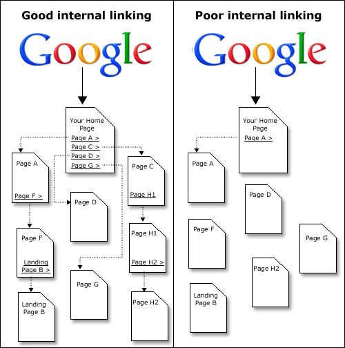
They are commonly implemented in two ways – main navigation menu and contextual links within content. The following diagram illustrates both.

Website Navigation Menu
As you may know, any website almost always has a navigation menu at the top or in the sidebar with internal links to its most important pages. Many also have the same, or different menu in the footer section at the bottom.
In addition, a menu item can also have a sub-menu directing to pages which are part of its information hierarchy.
When embedding internal links in the navigation menu, ensure the use of anchor texts in a way that they are relevant to the page they are pointing to. They should make sense for your users first, search engines second.
Internal Links Within Content
When you’re reading a page on a website, certain parts of the content are often internal links pointing to other pages.
This is done to point readers to additional information or actions, which are related but out of scope of the context of the current page.
When embedding internal links within content, it’s also a good practice to optimize the anchor texts in a way that they are relevant to the page they are pointing to, as well as contain the keyword you’d like that page rank for.
As you can see from these use cases, internal links help organize knowledge, so users and search engines could discover additional related content to consume on your website.
The benefit? Prospects visit more of your pages, bounce less, stay longer and engage further, which moves them along the content marketing funnel.
Moreover, search engines like Google take your internal links and the “visitor stickiness” caused by them as a signal to crawl and associate more importance to each of your content pieces.
That is why you should never have a “orphan” page on your website, which cannot be accessed from any of your other pages. Google will assume that any page without internal links in or out isn’t important enough to index or rank.

And for the same reason, there should be several internal links in your website structure pointing to your pillar/cornerstone content. These links will indicate that your pillar content is the most important part of your content architecture.
However, when you link two pages with a hyperlink, the connection should always be contextually relevant, along with proper anchor text.
The pages you link should actually be related to one another in some way. Adding internal links just for the sake of it is a recipe for disaster.
Setting up your content architecture
Now that you’re aware of the fundamentals of website structure and internal linking, it’s time to work on the same.
If you are starting a new website, follow these steps to plan an information architecture from scratch. But if you already have a website, you can still use these steps to audit, organize content and fix your current structure.
Consider Content Structures
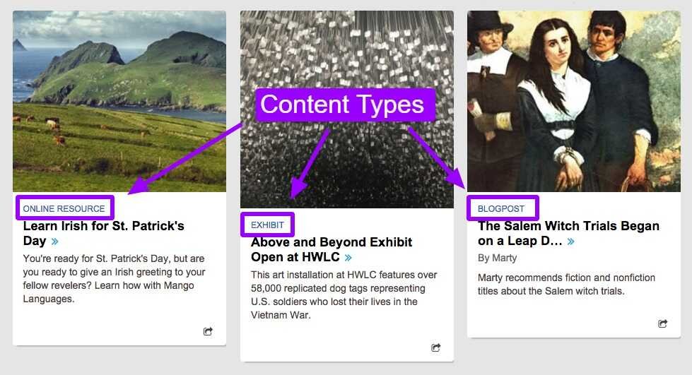
Take inventory of all the different types of content you may be using as part of your content strategy. This means classifying your content based on attributes that make it different from other types of content.
For example, blog post is a type of content. It has a set of certain attributes like author name, publication date, comments etc. This set is unique to blog posts only.
Another content type, like an event, may have its own unique set of attributes like registration deadline, host, commencement date etc.
Of course, blog post and event are not the only content types. Other commonly used content types include case study, portfolio, service, product description, and exhibit.

In fact, you can come up with your own new content types if they make sense for your business and audience.
Then, for each content type, you’ll also need to establish the attributes associated with them. You’ll also decide on the distinction between which attributes can be shown to your audience and which will be for internal use only.
Plan content hierarchy and relationships
Once you have some clarity on the different types of content you’ll be using, map out their hierarchical relationships.
Begin with your main content/pages and work inwards and deeper into more specific pages. By the end of this exercise, you’ll have something like this:

Remember, these will not just be parent-child relationships. They could also be lateral, or connected in some other way like through common tags or categories.
Modify content/connections on website
Now that you have mapped out the required content types and connections, make changes in your website and content to reflect them.
The instructions to do this will depend on how your website was built and whether it uses a content management system (CMS).
The most popular CMS is WordPress, and it’s also the one I use for this website. If you are using the same, I can help with some pointers on customization.
WordPress has three central features which let content type, hierarchy and relationships to co-exist without impacting each other.
By default, WordPress has two content types: Post and Page. But the good news is it is possible to create new content types by using a plugin such as Custom Post Type UI. To learn more, see this guide on custom post types.
To establish hierarchies, you can use the categories functionality which is available by default in WordPress. Learn more about WordPress categories here.
And finally, the tags feature in WordPress will come in handy for creating relationships among different types of content.

Tags let visitors quickly assess whether the content is relevant for their purposes, while hierarchies create sitemaps from which they can zoom in to see a specific item.
Final Thoughts
If I had to give you just one take away from this entire guide, it’s this: Think about the user. When you take care of your visitors, everything else falls into place.
When working on website structure, too often we are so focused on SEO and promotion that we lose the sight of what will make the most sense for the user.
At the end of the day, even Google’s algorithms are designed to favor websites which deliver the best experience to users. This means your website needs to have the best content, the best performance and the best content architecture.
If you organize knowledge and present it fast in the most relevant way possible, you’re doing what’s best for a prospect.
Same goes for SEO and marketing. Do the right thing when it comes to information architecture, and you’ll see yourself be rewarded for it.
Did I miss anything? Did you try these tips? Do you have any questions or comments? Share your thoughts below in the comments section.


