You may have a way with words, but text alone isn’t enough to engage readers with your blog content. The graphics that complement what you’re writing are just as important.
Many bloggers often make the mistake of treating images like an afterthought.
But this is a risky move, as using bad blog post images could be worse than no images at all. So let’s take a look at why it’s important to make your content visually appealing and the best practices to do so.
Disclaimer: If you buy any products through links on this site, I may earn a commission. But it doesn't make any difference to your cost, and it helps me keep this blog running. So you could always read my articles for free.
Why add images to your blog posts?
It’s hard writing a great blog post, even without any pictures. So why push for blog post photos?
What you might be failing to see is the negative impact of text-only content. When done right, visual content can not only reduce your bounce rate, but also boost engagement and conversions.
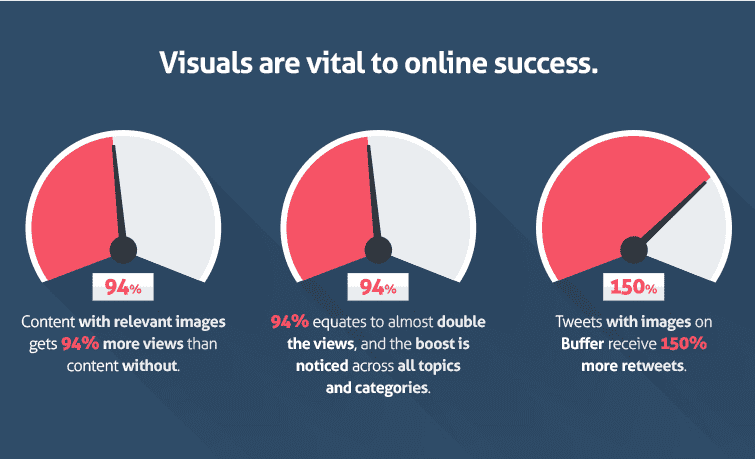
Let’s take a closer look at all the benefits associated with using images in your content.
Make Information Easier To Understand
Of course, you can write about the white sands and turquoise waters when describing a travel destination to your readers.
Text can dig into details, but only images can properly show the magic of being at a rocky hiking train.
Original, relevant graphics go a long way in bringing your topic to life. They capture it in a way that plain text just can’t. This gets you one step closer to making your content stand out in an otherwise cluttered web.
Increase The Odds Of Going Viral
Using images in your content makes it more likely to be liked, clicked and shared on social media.
Users pay more attention to visual content than text content, as is evident from recent success of visual social networks like Instagram and Pinterest.
The rise in visual content didn’t just boost the new social networks. Even established sites like Twitter, Facebook and LinkedIn have been playing catch-up.
For instance, tweets with a photo generate 150% more retweets. Similarly, a study shows that a Facebook post with a picture gets 2.3 times more engagement.
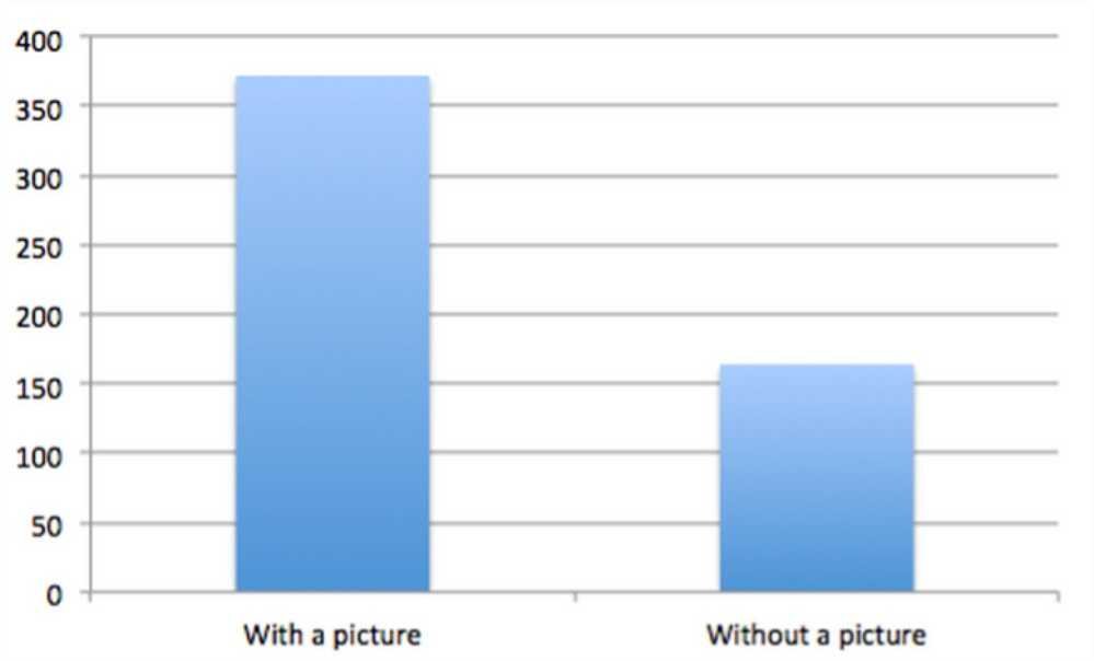
So there’s no way that you’d want to miss out on this opportunity to get more eyeballs by not using enough graphics in your content.
Make Your Content Memorable
Combining important information with stunning imagery makes it more memorable.
According to BrainRules, a picture makes it more likely that you’ll remember a piece of information even 3 days after you first encountered it.
We retain more information that comes from a photo than from either written or spoken words.
Make Your Content More Readable
Most of the online content is a lot of uninterrupted text. Sure, you can make it more readable by formatting it properly, breaking paragraphs, using subheading and bullet points and what not.
But it’s still text, and a lot of text is hard to read in a single go. That’s where graphics can make a difference and make your content more engaging.
Images break up large chunks of content. Adding pictures after every few paragraphs can keep your readers glued for longer.
Ways To Make Content Visual
Now you know how important visuals are, but what kind of images can you add to spice up your content? Let’s take a look at different ways in which you can make your content more visual.
Images With Quotes/Text
Quotes and headlines are a great way to highlight key sentences or paragraphs in your content. And you can make them look even more beautiful by setting text against an attractive background.
Adding a photo quote or title makes your content more memorable and shareable. A visual quote is ideal for posting on almost every social media channel.

Whether you use your title on a nice backdrop, use a picture to convey an important fact, or do something else, displaying a few key words in a visual format is an effective technique to boost engagement.
Statistical Data Visualization
Presenting complex data in visual form makes it instantly understandable. For instance, it’s one thing to write about the percentage of people impacted by an event, but much more compelling to present the same data in an illustration.
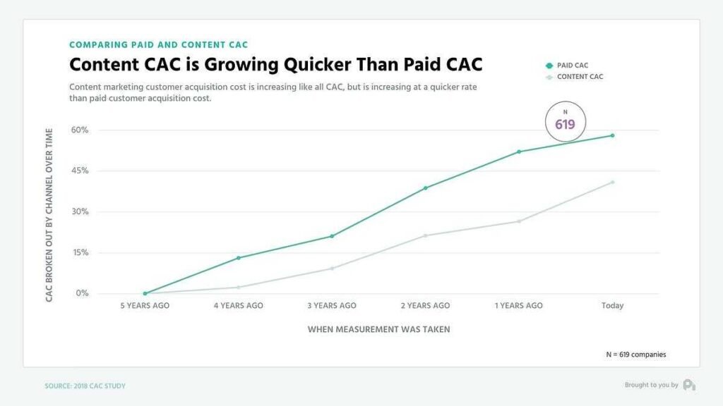
Image Source: ProfitWell
If you can make a trending topic digestible for your audience, you’ll end up with a piece of content which is shared the most, as it serves an important need for your audience.
Process Diagrams/Flowcharts
If you’re writing about how to do something, or how something works, then graphics are a great way to give readers a peek at inner workings of a product or system.
Carefully designed visual aid can walk your audience through anything from fitness workouts to setting up a coffee machine.
GIFs/Videos
Visual content with some sort of motion is currently the hottest trend among both marketers and their audience.
People find it much easier and more fun to consume content like GIFs and video clips. It also helps elevate the reach of your content, because then you can share it on video platforms like YouTube.

So embedding these elements throughout your blog post or other content can help your readers absorb information in a passive manner. Here are some places you can find the best GIFs to use in your content: Giphy, Tenor, and Imgur.
Annotated Screenshots
There are often tasks and processes you can explain better by showing your readers exactly what to do and how, step by step.
But you can’t show them what to do and where to click with text instructions alone. You need screenshots, with arrows or circles pointing to the things you want to highlight.
This really makes it easy for your audience to follow your instructions and accomplish something tangible.
The more helpful and useful your content, the more trust you’ll build with your readers.
Sourcing Photos
When it comes to adding visuals to your content, the first step is finding the images you can safely use or modify. Depending on your needs, you can then customize them, or use them as they are.
So here are the best ways to search pictures and graphics relevant to the topics you write about, along with the best practices to keep in mind.
Respect Legal Rights
Before we get into how to look for graphics to use in your content, it’s important to point out that you can’t just use any photo you find on the web. This is because you may not have the right to use that photo.
For most photos you find online, they belong to a website, which belongs to a brand or a person.
So the brand or person who is the owner of the photo can decide if other people are allowed to use the photo, by declaring a type of usage right.
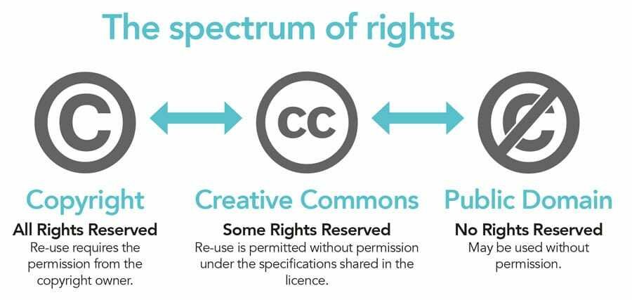
Image Source: ResearchOutreach
I don’t mean to make all of this complicated, so the only thing you need to remember is that if the owner of a photo hasn’t given you permission to use the photo, you just can’t copy or download it to use in your content.
You should only use photos for which you’re sure that they’re copyright-free and available in the public domain. So let’s take a look at how you can get those particular photos.
Use Google Image Search
I am saying it again so we’re on the same page: Is it not okay to use pictures you find via Google Image Search. You may or may not be allowed to do so.
However, there is a way to use Google Image Search to filter images by type of license, so you can figure out the conditions of using an image.
When you’re searching images in Google, click Tools. Then select an option from the Usage Rights dropdown.
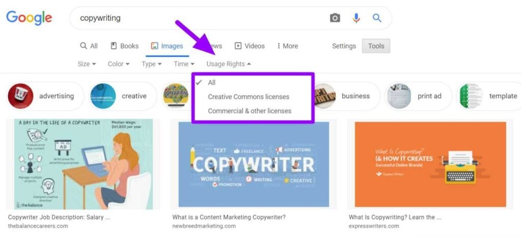
Once you have filtered the image search results using one of the two license options, you can view the license details attached with any of the search result photos.
Select an image, then below the image, select License details. Here’s what the two type of licences mean:
Creative Commons licenses: These images are usually free to use, but require credit.
Commercial or other licenses: These images have non-Creative Commons licenses and can be from either free sites or commercial sites that require payment.
Use Free Stock Photo Sites
Websites such as Unsplash, Pixabay, PicJumbo and Pexels are great to find unique images which can be used as a background when designing your visuals. These images are completely free to use and modify as you see fit.
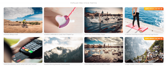
On most of the stock photo websites, you can simply search for broad ideas to find an image relevant to your topic.
Take Original Photos/Screenshots
If you’re good at taking photos and own a decent camera or smartphone, it’s surely something you can do for your content. Many fashion or food blogs, for instance, use their own photos.
Another occasion when you can take your own original pictures is when you need screenshots. There are many tools and browser extensions available for free to take screenshots on whatever device you want to show.
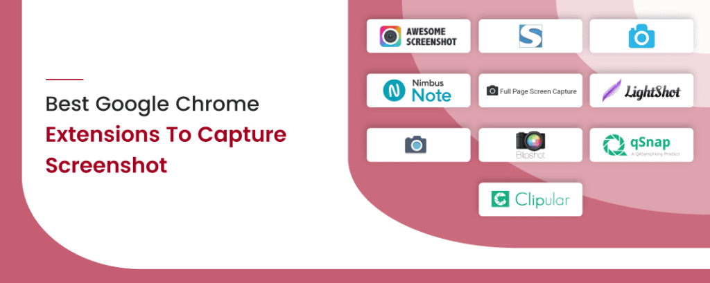
Image Source: SoftwareSuggest
Since the photos you take will then be your own original property, you will not need to worry about copyright or other legal issues.
Ensure Relevance
Use an image that’s original, attractive, and suited to your content. Don’t add photos randomly in your content just for decoration. Your image should be contextually relevant to the information you’re covering.
Before you use an image to complement a topic or point you’re making in your content, ask yourself, “Can this image be used for any other related topic also or is it specific to this very point?”
If the image can be applied to talk about dozens of different ideas, don’t use it unless it’s heavily edited. Your goal should be to include highly-relevant and enriching graphics that contribute to a great user experience.
Beware Of Generic Stock Photos
General stock photos (like someone typing on a computer) have become so commonplace that they don’t catch attention anymore.

Such an image could be used for hundreds of topics and has no specific relevance to any subject area. So you’re better off avoiding them.
Customizing Photos
Not every photo you take or find would be ready to embed in your content. In most cases, it would require some level of editing, merging, resizing or other manipulation.
However, professional graphic design software like Photoshop or Illustration are too complex for someone with no formal design education or experience.
But the good news is that even if you’re not a professional designer, you can design decent visuals using some beginner-friendly tools and tips that follow.
Free & Easy Graphic Design Tools
There are a number of graphic design tools online that allow you to pick the desired dimensions and create beautiful photos to use in your blog posts and other content. The most popular of these include Canva, Crello and DesignBold.
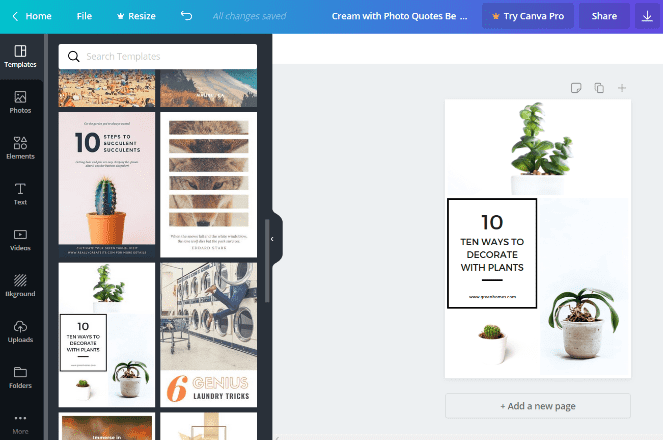
Moverover, they also have pre-made templates with all the components already in place. You can edit the text or anything else to have a stunning design ready to download in minutes.
Pick The Right Dimensions
Before you start creating or customizing an image, make sure to pick the appropriate size. Think about how it will appear in your content, as well as on social media.

You want to make sure that your images are optimized for best experience on the social media channels your audience use the most.
Be Consistent With Your Brand
Graphics are a very powerful part of forming a memorable brand identity. But only when you ensure that all the images you create have a consistent visual style, no matter the device or platform you share it on.
Using the same set of colors, logos, fonts and templates helps your brand stand out and become more recognizable from the pack.
For example, consider Endy, a Canadian mattress brand. Take a look at the type of visuals they create.

You’ll see that every photo they use on their website or social media channels follows a unique, carefully defined style.
Regardless of the type of picture you’re looking at, it’s always the same vibe, with the same logo font, and white and pick as their main colors for backgrounds or objects in the visuals.
The idea is to figure out and document your unique brand identity once, and then stick to it throughout your graphic and web design assets.
This document is known as a brand style guide. It includes directions for everyone from graphic and web designers to marketers and writers who are going to create any kind of collateral for your brand.
So you can ensure that all your outgoing communication always has one unique identity and voice, instantly recognizable by your audience.
Essential Best Practices
We have covered a lot of ground, but there are still some important things left for me to say which I couldn’t fit anywhere in the above sections. So let’s get them out of the way.
Add Adequate Number Of Graphics
BuzzSumo analyzed over 1 million articles, and found that articles with photos embedded after every 75-100 words got twice as many social media shares as compared to those with fewer pictures.

Image Source: BuzzSumo
Of course, the number will vary based on the type of content you’re writing and its topic.
But the BuzzSumo study goes on to show that when it comes to adding graphics to your content, what you think as too many may just be normal, in fact, better for your audience.
So whatever you’re writing about in your blog post or other content, never miss an opportunity to add a visual aid if you can.
Optimize Images For SEO
Optimizing images for search engines help them better understand the contents of your visuals, while also enhancing user experience.
The first requirement is that any information presented in an image must also be presented in an alternative format (for people who cannot view images). This means every image on a web page must have alt text describing the image.
Also, if the image is associated with an action or concept, the alt text should refer to the name of the action or concept rather than the literal description of the image.
For example, if a search field has an image of a magnifying glass to signify that clicking on it will initiate a search, “Search” will be more useful alt text than “Magnifying glass”.
Secondly, make sure to have descriptive but short file names for your photos, based on what the image depicts.

Image Source: Mangools
For example, instead of using a file name such as “Photo123.jpg,” name it as “semrush-seo-tool.jpg.”
Compress Images For Faster Loading
A high page loading speed is also an essential part of your user experience as well as search engine rankings. Images with large file sizes can not only tank your rankings, but also increase the bounce rate.
To optimize images before embedding in the content, the first thing you can do is to pick the appropriate file type. The most common picture file types are JPEG and PNG.
JPEG is the best choice in most cases because of lower file size, without considerable loss in quality. If your image is in any other file type, there are free tools you can use to convert a photo into JPEG.
However, for photos with a transparent background, you will need the PNG file type. PNG files are heavier than JPG files, so use them only when you need better quality and JPG is not a choice.
Once you have your image in the desired file type, you can reduce its size even further by using a compression tool, like CompressJPEG or TinyPNG. Though not always possible, you should aim for less than 100 KB file size per photo.
Conclusion
If you’re looking for effective ways to transform your content performance, adding images to your content pieces is a must.
As we discussed, graphics make your blog posts more appealing, keep your readers engaged. Moreover, they make your content easier to digest and more memorable.
Add in the benefits of more shareability and higher engagement from social media, and you’ll find that using visuals in your content is a strategic move you can’t overlook.
So start today, go ahead and examine the photos you are already using in your existing content, and restructure your visual strategy going forward.
Did I miss anything? How do you add graphics in your content? Do you have any questions or comments? Share your thoughts below in the comments section.


